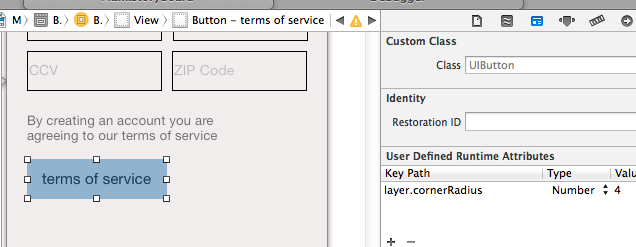
Z Swift 3/iOS 10, można utworzyć podklasę UIButton aby mieć przycisk niestandardowy, który będzie wyglądać niebieski przycisk z zaokrąglonymi obramowaniami w aplikacji AppStore na iOS.
Poniższy kod ilustruje sposób prawidłowego zarządzania kolorami tinty (gdy przycisk znajduje się za przyciemnionym widokiem UIAlertController), kolor tytułu, podświetlony kolor tła, styl ramki, kolor ramki i wstawki treści.
Przycisk niestandardowy.SWIFT
import UIKit

class CustomButton: UIButton {

    override init(frame: CGRect) {
     super.init(frame: frame)

     setProperties()
    }

    required init?(coder aDecoder: NSCoder) {
     super.init(coder: aDecoder)

     // Make sure to set CustomButton as the class of the UIButton in Identity inspector of storyboard
     // Make sure to set Custom as the type of the UIButton in Attributes inspector of storyboard
     setProperties()
    }

    func setProperties() {
     // Set tintColor (only if you want to replace the system default tintColor)
     // tintColor = .red

     // Set the border's color
     layer.borderColor = tintColor?.cgColor

     // Set colors for title's states
     setTitleColor(tintColor, for: .normal)
     setTitleColor(.white, for: .highlighted)

     // Add some margins between the title (content) and the border
     contentEdgeInsets = UIEdgeInsets(top: 5, left: 10, bottom: 5, right: 10)
    }

    override var isHighlighted: Bool {
     didSet {
      // Toggle the background color according to button's highlighted state
      backgroundColor = super.isHighlighted ? tintColor : nil
     }
    }

    override func tintColorDidChange() {
     super.tintColorDidChange()

     // When the tint color is changed by the system (eg when the button appears below the dimmed view of a UIAlertController), we have to manually update border color and title's text color
     layer.borderColor = tintColor?.cgColor
     titleLabel?.textColor = tintColor
    }

    override func draw(_ rect: CGRect) {
     // Draw the border
     layer.borderWidth = 1
     layer.cornerRadius = 4
     layer.masksToBounds = true
    }

}
ViewController.swift (tworzenie zwyczaj przycisku programowego)
import UIKit

class ViewController: UIViewController {

    override func viewDidLoad() {
     super.viewDidLoad()

     let button = CustomButton()
     button.setTitle("Normal", for: .normal)
     button.setTitle("Highlighted", for: .highlighted)
     button.addTarget(self, action: #selector(presentAlert(_:)), for: .touchUpInside)
     view.addSubview(button)

     // auto layout
     button.translatesAutoresizingMaskIntoConstraints = false
     button.centerXAnchor.constraint(equalTo: view.centerXAnchor).isActive = true
     button.topAnchor.constraint(equalTo: view.topAnchor, constant: 100).isActive = true
    }

    /// Present alert when button is tapped
    func presentAlert(_ sender: UIButton) {
     let alertController = UIAlertController(title: "Title", message: "Message", preferredStyle: .alert)
     let alertAction = UIAlertAction(title: "OK", style: .default)
     alertController.addAction(alertAction)
     present(alertController, animated: true, completion: nil)
    }

}
ViewController.swift (alternatywny do tworzenia własnych przycisku w ujęć):
import UIKit

class ViewController: UIViewController {

    @IBOutlet weak var button: CustomButton!

    override func viewDidLoad() {
     super.viewDidLoad()

     button.setTitle("Normal", for: .normal)
     button.setTitle("Highlighted", for: .highlighted)
    }

    /// Present alert when button is tapped
    @IBAction func presentAlert(_ sender: UIButton) {
     let alertController = UIAlertController(title: "Title", message: "Message", preferredStyle: .alert)
     let alertAction = UIAlertAction(title: "OK", style: .default)
     alertController.addAction(alertAction)
     present(alertController, animated: true, completion: nil)
    }

}
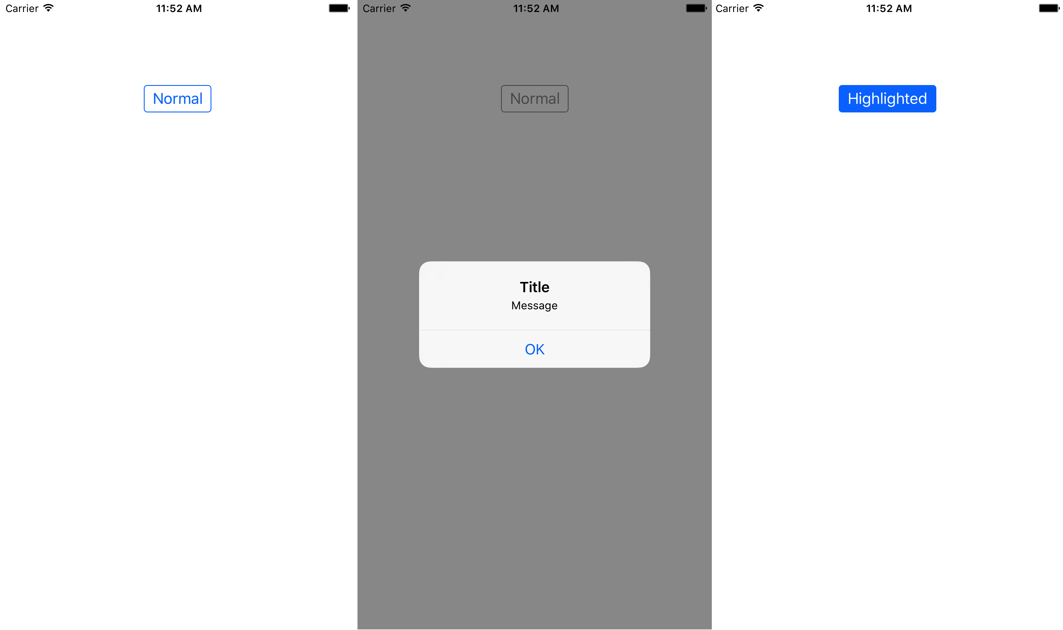
Poniższy obraz pokazuje, jak niestandardowy przycisk będzie wyświetlany w stanie normalnym, kiedy system tinColor zostanie zmieniony (za przyciemnionym widokiem stanu UIAlertController) oraz w stanie highlighted.
See [moja odpowiedź] (https://stackoverflow.com/a/44215369/1966109) dla Swift 3/iOS 10. utworzyć podklasę 'UIButton' aby mieć zaokrąglone obramowanie przycisk. Ta podklasa zarządza kolorystyką tytułu, podświetleniem koloru tła, stylem krawędzi i wstawkami zawartości. –